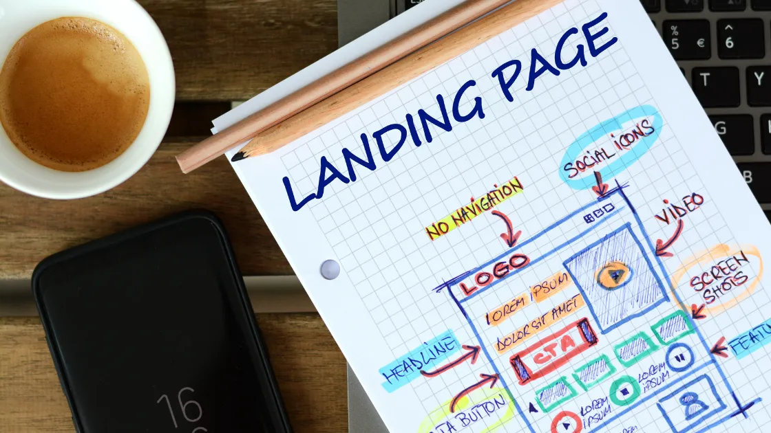
Running ads is only half the battle. If your landing page isn’t optimized to convert visitors into leads or customers, you’re leaving money on the table. A high-converting landing page bridges the gap between your ad and the action you want users to take — whether it’s a purchase, sign-up, or download.
Here’s how to set up a landing page that drives results:
1. Start with One Clear Goal (One CTA)
Your landing page should have one primary goal — not multiple distractions. Whether it’s to buy, sign up, or download, make your call-to-action (CTA) super clear.
Examples:
• “Get My Free Guide”
• “Start My Free Trial”
• “Book a Demo”
Avoid clutter like extra navigation links, multiple CTAs, or unrelated offers.
2. Match Your Ad Message (Ad-to-Page Consistency)
If your ad says “Get 50% Off Today Only,” your landing page should show the same offer upfront. Consistency builds trust and reduces bounce rates.
Ensure:
• The headline matches your ad
• The design/look is similar (fonts, colors, vibe)
• The offer is identical (no surprises!)
3. Craft a Magnetic Headline
Your headline should instantly tell users what they’ll get and why they should care.
Make it:
• Benefit-driven: “Grow Your Email List in 7 Days”
• Clear, not clever: Avoid confusing or vague wording
• Short and powerful: Use action words and urgency
4. Use Visuals that Sell
People process visuals faster than text. Include high-quality images or a short explainer video that supports your message.
Best practices:
• Show the product or result (before-after, app UI, etc.)
• Use real people to build connection
• Keep videos under 60 seconds
5. Add Trust Signals
Social proof increases credibility and confidence. Show that others have already benefited from your offer.
Include:
• Customer testimonials
• User counts: “10,000+ Downloads”
• Security badges or guarantees
• Urgency badges like “Limited Time Offer”
6. Keep Your Copy Clear & Benefits-Focused
Avoid fluff. Instead, focus on why the visitor should take action.
Tips:
• Highlight key benefits, not just features
• Use short bullet points
• Break content into scannable sections
Example:
“Our app has 256-bit encryption.”
“Your data stays safe with bank-level security.”
7. Make the CTA Stand Out
Your CTA button is where conversions happen. Make it visually bold and textually specific.
CTA Tips:
• Use high-contrast colors (orange, green, red)
• Use action-oriented text like “Get Started Now” or “Grab the Deal”
• Keep the form simple (only ask for what’s necessary)
8. Optimize for Mobile
More than half of users will visit via smartphone. If your page loads slowly or looks broken on mobile, you’ll lose conversions fast.
Checklist:
• Fast loading speed (under 3 seconds)
• Responsive design
• Clickable CTA and easy-to-fill forms
9. A/B Test Everything
Even small tweaks can boost your conversion rate. Use A/B testing tools to experiment with:
• Headlines
• CTA button colors/text
• Images/videos
• Layout and design
Use tools like Google Optimize, Unbounce, or Elementor A/B Testing (WordPress).
10. Track & Improve
Use tools like Google Analytics, Meta Pixel, or Hotjar to monitor how users interact with your page.
Track:
• Conversion rate
• Bounce rate
• Scroll depth
• CTA click-through
Then, optimize based on data, not guesses.
Final Thoughts
A high-converting landing page isn’t about being flashy — it’s about clarity, trust, and action. When your ad and landing page work together seamlessly, your ad spend becomes an investment, not an expense.
Whether you’re running Google Ads, Facebook Ads, or YouTube Ads, your landing page is the final push that turns a click into a customer.
